2. Parago
Services
Branding
Logo Design
UI/UX
Logo Design
UI/UX

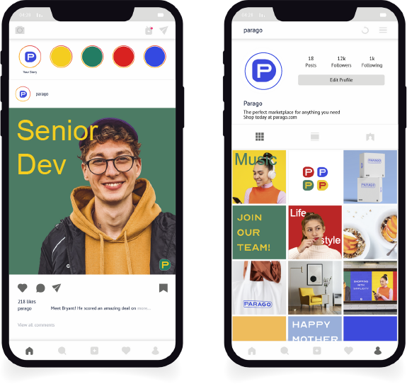
Parago is an online marketplace designed to make shopping easy and distraction-free. I wanted the branding to be just as straightforward and functional, so I went with primary colors and a simple sans-serif font. The name Parago comes from the word "paragon," which means a perfect example of something. I aimed for this fictional marketplace to embody those ideals by being honest, minimal, and practical.
Unlike other online stores, Parago focuses on helping customers find what they need without the hassle of pop-up ads, cookies, and unnecessary promotions. With a clean layout, thoughtful color choices, and no complicated features, shopping on Parago is meant to be a smooth and enjoyable experience.


